
Making a Gradient with Adobe InDesign
Making a gradient with Adobe InDesign is surprisingly convoluted. In this tutorial video I’m sharing techniques for making them a little easier.

“How to Design a Small House” (cover variations)
There are countless ways to layout a handful of elements, but arriving at the best possible arrangement is not always quick or intuitive. Here are twenty layout variations for one book cover.

Paul Rand: The Art of Design (Online Auction Results)
The studio of Paul Rand went up for auction in the Fall of 2018. There were numerous classic prints and posters designed by Rand, but the real treasures were the objects in which he had some level of personal interaction or regular use.

Graphic Design Book Club
I have been thinking about starting a Graphic Design Book Club (GDBC) in order to read some advanced texts about graphic design. We’d get together about once a month to discuss the reading and learn a thing or two from one another.

Course Page Redesign
In an effort to highlight my course material I’ve decided to make a couple changes to the way my site looks and functions. The layout of my “Courses” page has changed, using less real estate at the top and prominently featuring a handful of recent posts from my “Class Blog.”

Measuring Cooper Black
In honor of the typographic measurements topic we’re about to discuss in my typography class, I dug up some photos from the time I took that idea to the height of absurdity. Along with my buddy Lance, I drove from Bowling Green to Toledo one afternoon in order to measure the monumental Toledo Pride sign hanging above St. Rt. 75 for a graphic design workshop I was involved with.

Link Index Mock-ups
I have been thinking about the idea of sectioning my site into four major groupings and representing each of those sections of the site with a different primary display face. Today I mocked-up a couple ways that idea might function as a home page.

Combining Typefaces: Fifteen Ideas in Fifteen Minutes (typography lecture)
In this article I’m outlining fifteen ideas to help produce successful, memorable, and interesting typographic pairings. I’ve also provided my lecture slides for reference.
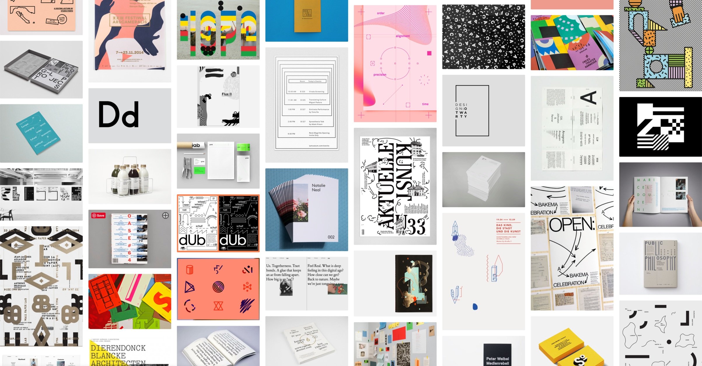
The Way Things Look
I have been bookmarking examples of contemporary graphic design on a Tumblr blog called The Way Things Look for about 6 years now.

Starting OMNIBUS XI
My friend Amy at 826michigan recently asked me if I’d design another edition of the OMNIBUS for them. It’s only been a few months since wrapping up the last one, and the fatigue hasn’t quite worn off yet, but for whatever reason, I said “ok, let’s do it!” Hopefully I won’t regret that.

Match Akkurat with Untitled Serif
Last night I spent a little time looking for a serif to partner with Akkurat for a book I’ve been working on.

2019 Calendar (Ten Year Anniversary)
This is a simple update on my original 2009 poster. I tried modifying the layout, but couldn’t find anything substantial I wanted to improve so I left it the same. Maybe I’ll update this calendar again in another ten years.

Hello Lydia
Last night I splurged on Lydia, the moderately aggressive, but friendly calligraphic typeface from London-based foundry, Colophon.

Dot Dot Dot 15
I have been plucking off older issues of Dot Dot Dot from eBay and recently got issue fifteen for a reasonable price. The older issues are much more scarce and becoming very expensive.

Bringhurst Quote
I’ve been reading Robert Bringhurst’s “The Elements of Typographic Style” with a couple friends. Here is one of my favorite quotes from the book.

New ways to mock-up old projects
I go through occasional bursts of preparing older projects for display on my website, always driven by one thing or another, usually a job application or AIGA get-together. The question always comes up: how to present them?

HITS Wordmark Exploration
A few screenshots of a massive logo project I’ve been working on for a few days.

Nikki J Dressed for Sci-Fi Fridays
My coworker, Nicole (aka “Nikki J”) wearing a shirt I designed for our new event series “Sci-Fi Fridays.”
HITS Office Olympics 2018
A few screenshots of a wordmark I’ve been working on for our office olympics at work.

Smart Object Test
Blog
Tags
- Adobe After Effects 3
- Adobe Illustrator 4
- Adobe InDesign 4
- Adobe Lightroom 50
- Adobe Photoshop 2
- Adobe Premiere Pro 1
- Art History 1
- B&W Photography 11
- Capture One 6
- Collage 3
- Film Simulation Recipe 24
- Fujifilm X-100F 27
- Fujifilm X-70 9
- Fujifilm X-M1 2
- Fujifilm X-T20 41
- Fujifilm X-T30 38
- Fujifilm X-T4 23
- Fujifilm X70 19
- Fujinon 14mm f/2.8 13
- Fujinon 16mm f/1.4 5
- Fujinon 16–80mm f/4.0 8
- Fujinon 18mm f/2.0 13
- Fujinon 18–55mm f/2.8–4.0 15
- Fujinon 23mm f/1.4 3
- Fujinon 27mm f/2.8 9
- Fujinon 35mm f/1.4 30
- Fujinon 35mm f/2.0 15
- Fujinon 50mm f/2.0 6
- Fujinon 55–200mm 1
- Fujinon 55–200mm f/3.5–4.8 10
- Generative Art 4
- Graphic Design 38
- Instant 110 for iOS 6
- Jittergram for iOS 4
- Lensbaby Sol 45 1
- Motion Graphics 3
- Python & Drawbot 4
- Risograph 2
- Sigma 19mm f/2.8 DN 6
- Sigma 30mm f/2.8 DN 17
- Sigma 60mm f/2.8 DN 5
- Sony 16–50mm f/3.5–5.6 20
- Sony NEX-5T 54
- Stop Motion 1
- Tiffen Pro Mist 2
- Travel Photos 55
- Typography 6
- VSCO for iOS 20
- iPhone 4S 11
- iPhone 6 14